Whether it’s a design for web or print, one question I’m constantly asking myself is “Will the reader be able to read this?”. This might sound like a dumb question at first, but there’s a lot of factors that will make or break your design when it comes to readability. Understanding some simple basics will ensure that your readers stay focused on what you have to say – without losing their attention.
Before we begin
Let’s talk about readers. Readers are a fickle bunch. You will never get everyone, everywhere, at all times, to read every word you write. It simply will never happen. Most people are too busy and too impatient to stop and read everything. The fact is, only 10% of people read everything you write, 80% read some things, but lose interest easily, and 10% read nothing. The 80% group of readers are who I’m focused on in this article. These are the readers that will decide whether or not to read your design in a split-second after viewing it. And the other 20% you ask? Well, there’s no changing them, so our job is pretty easy when it comes to those readers. Ok, so on to the basics.
Organize information using headlines and subheads.
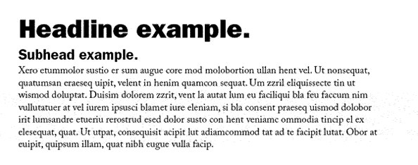
This is pretty self-explanatory. Your headline should be a larger font than your body text. It should be simple and to-the-point. Your reader should be able to grasp the idea of a section by simply reading the headline. Headlines serve as an attention-getter, pulling your reader in and allowing them to read the text. The more well-written your headline, the greater chance your reader will be drawn to the rest of what you have to say.
Similarly, your subhead should be written the same way, although it can be slightly longer. I personally like to keep the font size significantly smaller than the headline, but larger than the paragraph text. Subheads can be bold or regular in weight – do whatever looks best.
Paragraphs: Font Size, Line Spacing, and Line Length
When styling your main text, here are a few thoughts to keep in mind:
Font size
When determining font sizes, your first question should be “who’s my target audience”? For younger readers, try to keep your paragraph font size smaller. For older readers with poorer eyesight, I tend to increase the font size by a couple points, but still be careful to not make it too large. For print, the default size of most word-processing programs is 12 point text. For web, this is a very normal font size. However, for print I usually go much smaller. Of course, it depends on what font you’re using, but anything between 9 and 11 points will do for most copy-heavy publications.
Line Spacing (leading)
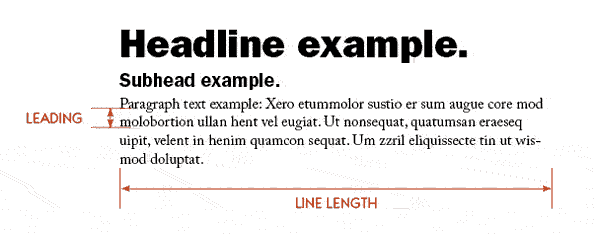
Leading refers to the amount of added vertical space between lines of text. Most word-processing programs set the default leading at 2 points more than the font size. For the most part, the default setting looks fine. However, depending on which font you’re using and how large or small the point size is, you may want to experiment with different sized leading from time-to-time. Bumping up the leading by a couple points can sometimes set your design apart and really make it stand out. Just be careful not to increase the leading too much. Line spacing that is too large will often detract from readability.
Line length
The human eye, at normal reading distances, can only focus on a small area at a time. With long line lengths, the muscles in the eye tend to strain, as they have to move more to follow from the end of a line to the start of the next line. Also, as line length increases, retention decreases, since it’s easier for readers to accidentally skip a line or lose their place. Ideally, keep your columns shorter in width to avoid these problems. There are many studies and opinions on line length, and there isn’t one set answer that will apply for every situation. This article talks about several formulas you can try on your own to determine proper line length. Just remember, balance is key. If you feel uncomfortable reading it, then your line length might be too long or too short.
Keeping in mind, a few simple rules will help your text get noticed and read by more people. In my next article, I hope to get more in-depth about some typesetting do’s and don’ts. Stay tuned!

