If you have a site that’s already created and you want it to look good on a mobile phone or tablet, this post is for you. Lately, I’ve been getting into optimizing my some of sites for mobile using CSS media queries. One such example is this site: www.weconnect.com
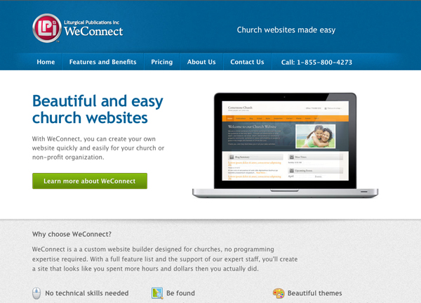
If you visit the site using your normal desktop browser, you’ll see this:
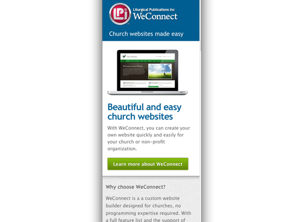
Taking your browser window, try reducing the width of the window horizontally. It should look something like this:
As you can see in the example, quite a lot of things changed when I made my screen smaller.
- The main navigation disappeared
- The image of the laptop went above the headline
- The fonts became smaller and more suitable for a small screen.
- The bottom navigation became more mobile friendly
So, how did I do it?
Getting Started
Download HTML5 boilerplate
First, I went to the HTML5 boilerplate site for mobile. This will set you up with everything you need to to make your site mobile-friendly: https://html5boilerplate.com/mobile By implementing the mobile boilerplate, I was able to get the correct meta tags and css I needed to ensure my site looks great on smaller windows.
CSS media queries
Being a designer first and a developer second, I was a bit freaked out by the idea of media queries. It wasn’t until I began to dig into them that it all began to finally click. It’s really a simple concept – using CSS, media queries basically detect the pixel width of your browser display, and change the CSS declarations to modify your design to better fit the page.
At the bottom of the boilerplate CSS file, you’ll notice an area for Media Queries. This is where you place all the styles that make your site look normal at a certain browser size. I pasted all of my site’s CSS into this area and set the media query like so:
@media only screen and (min-width: 974px) {
So at 974px screen size, everything on my site should look as I designed it. Everything ABOVE the media query section should be the CSS that makes the site look good at a smaller resolution.
To start, I set my browser window width to the default iPhone screen resolution to start with (320×480). Then I inspected my code with Firebug (you can use whatever inspection tool you want) and started changing my CSS to make everything look nice on the smaller screen resolution. As I made CSS changes, I made a duplicate of my existing code, edited what I needed, and put that CSS ABOVE my media query.
Careful now
As I went along, I was careful to periodically check the site at the full browser resolution to make sure my styles weren’t overriding anything and breaking the design. I also made sure that I didn’t duplicate a lot of code. Some of my CSS could be used at the 320px browser size AND at the 974px size. So as I went along, I started stripping out CSS from my media query that could be used for any browser size and pasting it in the area above the media queries. By the end of the project, my media queries section only contained the styles that were necessary for making the site look normal at the 974px size.
Hopefully this gives you a good starting point as to how to dig into CSS media queries.

