Recently, Google announced major updates to mobile search results. What it all boils down to is this: if your site isn’t mobile-friendly, it’s not as relevant. Study after study like this one show that mobile users have overtaken desktop users in just about every category, and Google is rewarding sites that are optimized for mobile browsers.
Test your site
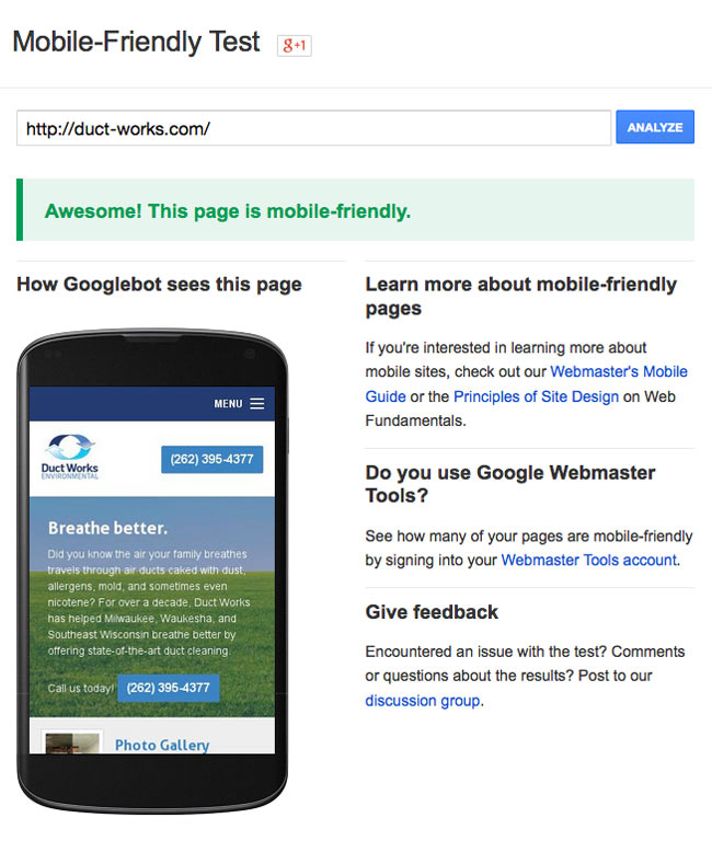
Knowing the importance Google is placing on mobile friendly sites, the next step is to find out if your site is mobile friendly. Fortunately, Google created a useful tool for just this reason: https://www.google.com/webmasters/tools/mobile-friendly/. You can enter your domain name and preview how Google sees your site on a mobile device.
Below is an example of what the page looks like. I ran the test with a client’s site which I recently converted to be mobile friendly.

This test measures whether your site is mobile friendly on several levels, including:
- Mobile viewport not set
- Content wider than screen
- Links too close together
- Text too small to read
My site isn’t mobile-friendly. What’s the next step?
For the past couple years, I’ve been helping my clients transition their sites to become responsive. Responsive web design means delivering the same content and experience of your website on any device and any browser, but simply changing the way it’s displayed to best suit the screen width of your browser. This method has been around for a few years and is the preferred approach for making a site mobile-friendly.
There are other methods that have been around longer, such as creating a separate mobile version of your site, detecting the device’s browser, and serving a basic and limited version of your site’s content. Without getting into this too much, it’s safe to say this is bad practice. Users today desire access to all of your site’s content on their mobile devices, and do not want a limited experience.