For those who don’t know, I work full time for a company called Liturgical Publications Inc as their web designer. This week our web design team launched a redesigned seekandfind.com which is one of LPi’s online products. Seek and Find is a listing site for businesses and churches. Here, users can find church bulletins, community newsletters, and the advertisers that support them. Every business listed with Seek And Find supports a local church, synagogue, or senior center by sponsoring an advertisement on their bulletin, newsletter, or website.
This project was a collaboration between 4 developers and 1 designer (myself) and it took just under a year to complete. Our task was to completely redesign, rebrand, and redevelop a site that was long overdue for a change. The old Seek And Find was very slow. It would take anywhere between 9 and 18 seconds to search for content. Thousands of people nation-wide depend on this website to get their church bulletins each week. Our task was to speeding up the site functionality and provide a better overall user experience. My job was to design the branding and user-interface, as well as coding the front-end.
Here’s a look at the old site:
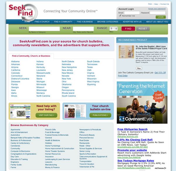
The old site certainly had some design flaws: take for example, the logo is covering up the navigation menu. It required that the user fills out two search fields and sets their range. Then it took about 20 seconds for the query to go through.
The old logo:

The old logo was a bit awkward and needed a complete redesign.
The new logo:
The requirements of the new logo were that it had to go well with our parent company, Liturgical Publications Inc. So the circular theme was carried over. Overall it’s a much cleaner looking logo than it’s predecessor.
The new site:
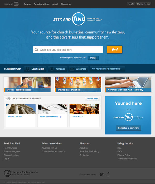
The core functionality of the site is completely location-based: meaning the content is local to the individual user. This will provide Seek and Find visitors with a much more personalized experience.
Listing pages:
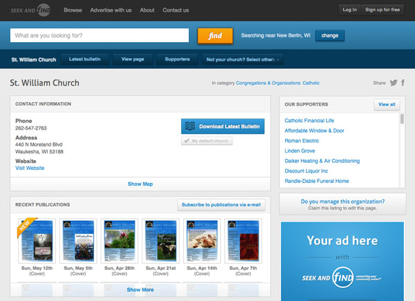
Then new listing page is much more organized. When the user logs in to manage their listing page, all editing is in real time. Meaning they simply click on a section and a modal appears with the content they’re editing. No complicated user-interface must be learned.
Browse page:
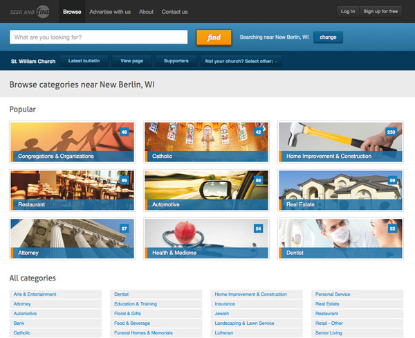
The new browse page features a category list with images shown for the 9 most popular categories according to the user’s location. The full list is shown below these.
Browse results:
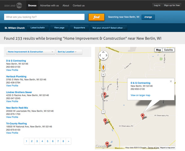
When hovering over an item, the map centers on that location automatically. Results can be sorted by category or location.
About page:
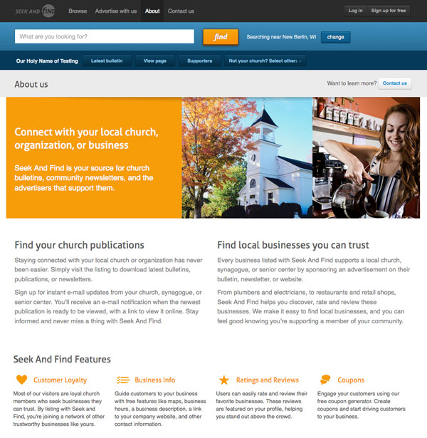
The new about page was created to provide a clear explanation of what Seek and Find is and how it’s beneficial to its users.
Mobile:
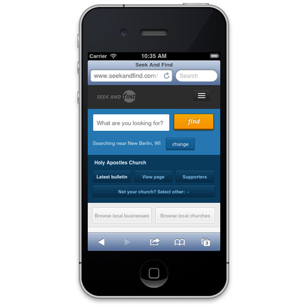
The site is also completely responsive – optimized for mobile phones and various sized tablets. Using media queries, we’re able to detect changes in screen sizes and alter the way the site looks on any mobile device. This way, the site is perfectly suited for the best user experience no matter what device they’re using – without the need for a separate mobile site.
Hopefully Seek and Find’s refreshed branding and improved website will be a good compliment to the communication and publishing services provided by Liturgical Publications Inc.

Comments are closed.